Nord Atom UI

An arctic, north-bluish clean and elegant Atom UI theme.

Designed for a optimized fluent and clear workflow matching the Nord Atom Syntax theme.

Screenshot showing Atom with the floating command palette modal overlay with a big font type.

Your IDE. Your style.

The unified UI and editor syntax element design provides a clutter-free and fluidly merging appearance.

Screenshot showing the code editor in combination with UI elements like the tool-bar and minimap package
Syntax highlighting in the editor in combination with UI elements like the tool-bartool-bar and minimap packages.

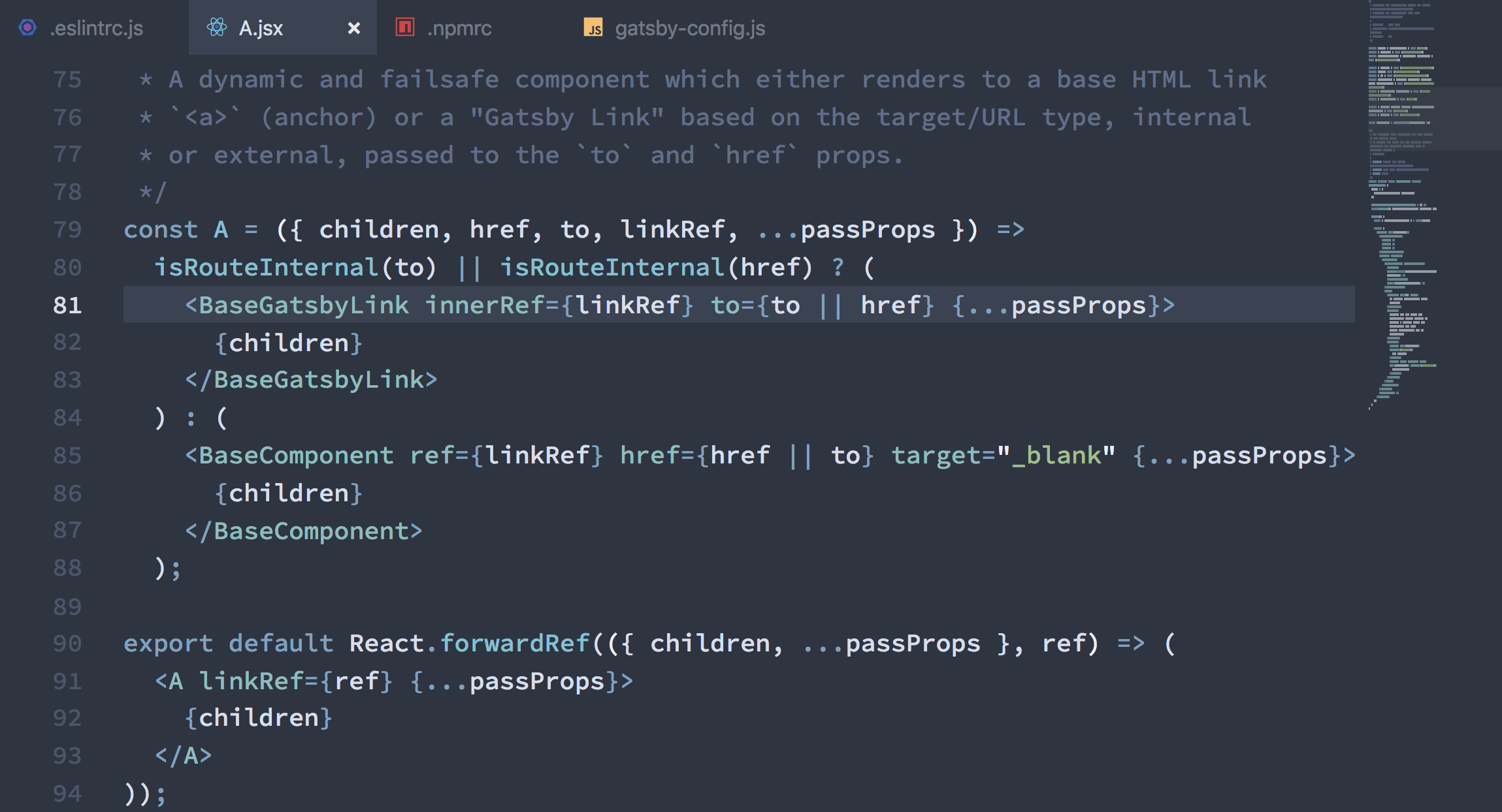
Uniform design with beautiful UI elements.

The themed UI elements provide a fluid and unobtrusive transition from the code editor to the IDE.

Screenshot showing the floating fuzzy finder modal
The floating fuzzy finder modal.
Screenshot showing basic UI components of the settings views.
Basic UI components of the settings views.

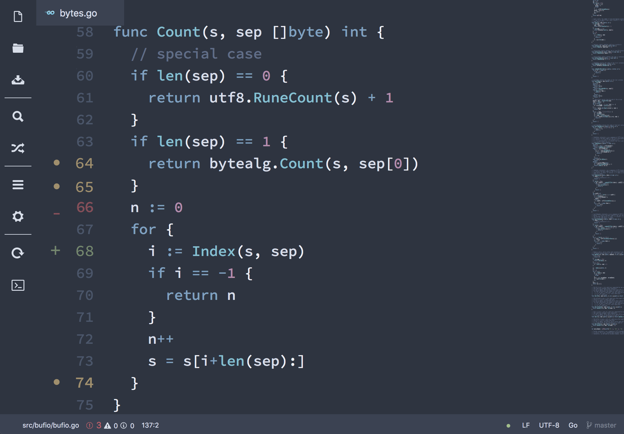
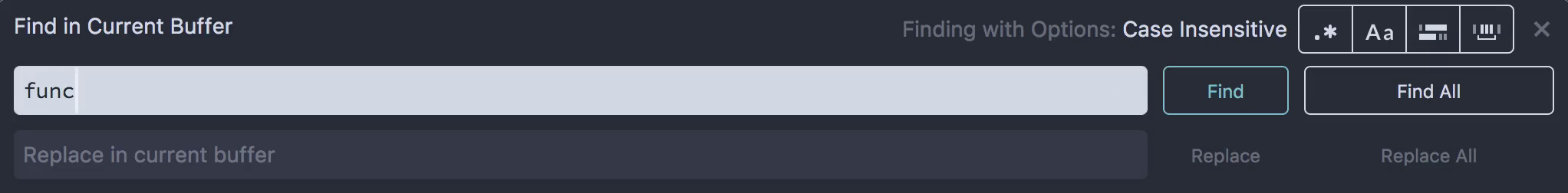
Sane styles for basic UI components used in Atom's core panels and panes like the settings view.

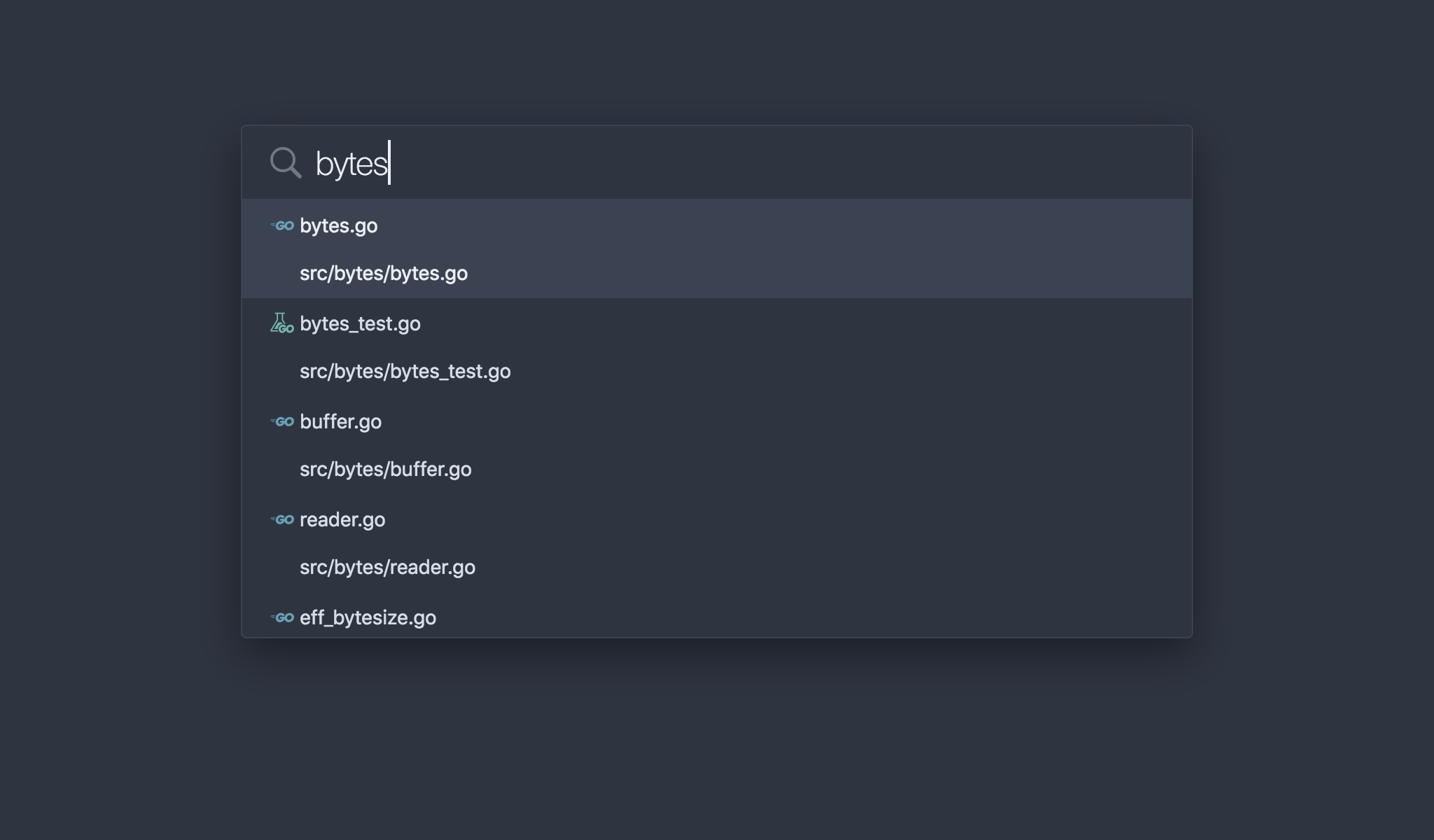
Elegant floating modals wth a big font type and unobtrusive notifications.

Floating modals and notifications.
Tab highlighting and save state indicators.

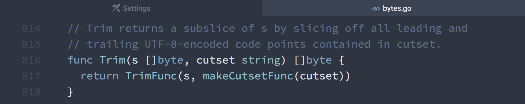
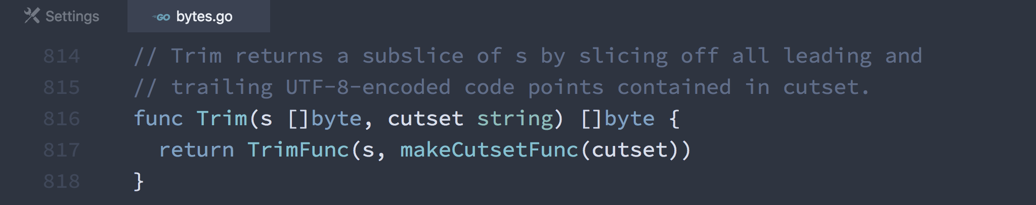
Active and inactive tab highlighting with well recognizable save state indicators.

Take your favorite packages with you.

The theme supports many popular UI packages for fluid and unobtrusive user interface transitions.

Screenshot showing a React JSX component with the minimap package to keep an overall overview of the whole file
A React JSX component with the the minimap package to keep an overall overview of the whole file.
Screenshot showing the tool-bar package for a minimal style for common views and tasks
The tool-bar package for a minimal style for common views and tasks.

Packages like tool-bar allow to achieve a minimal style for quick access to common views and tasks.

Screenshot showing the card view of the expose package
The card view of the expose package.
Screenshot showing the color-picker package with adjusted styles
The color-picker package with adjusted styles.

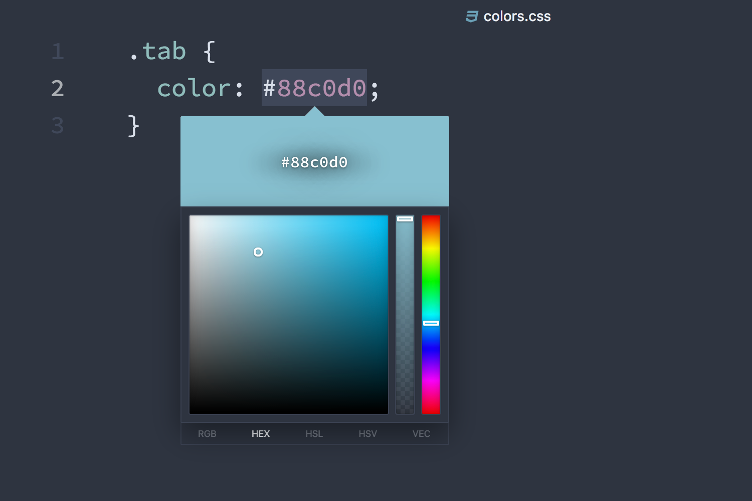
Smooth integration of floating UI components like the color-picker package.

Configure it to fit your needs.

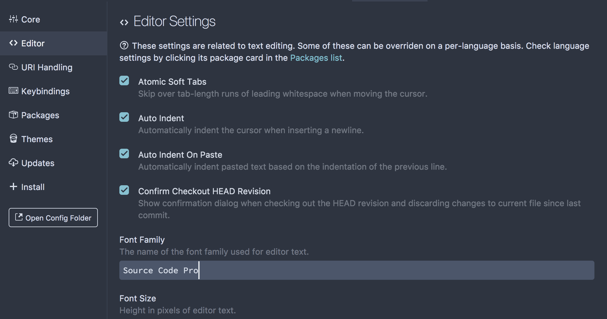
Theme configurations like full-width tabs or darker form focus effects allow to customize the theme to match your personal preferences.

Screenshot showing Atom with enabled full-width tab configuration
Tabs with enabled full-widthconfiguration.
Screenshot showing Atom's default tab style
Default tab style.
Default and darker form focusing effects.

Adjust UI elements effects like the focus of forms to adjust Atoms usage experience and appearance.

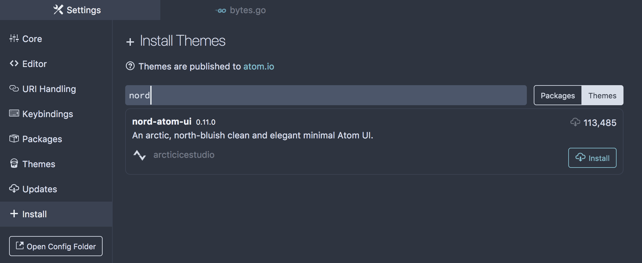
Installation and updates with one click.

Install Nord from the official theme package registry with one click including automatic updates to always use the latest Nord version.

Screenshot showing the builtin theme package registry view
The builtin theme package registry view.